In this note, I will analyze the data from more than 10 indicators to structurally see what differences Ethereum had between its historical highs of 2021 and 2025.
First, I will share a general comparative chart of the differences so you can have a global perspective. I will then explain with educational conclusions what these data mean:
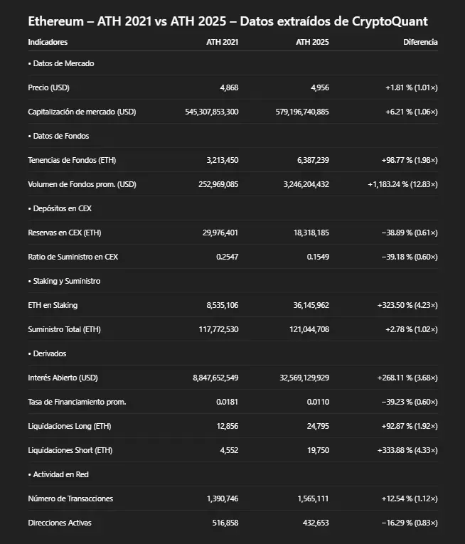
Clarification: In all on-chain graphs, the white line is the price of ETH.
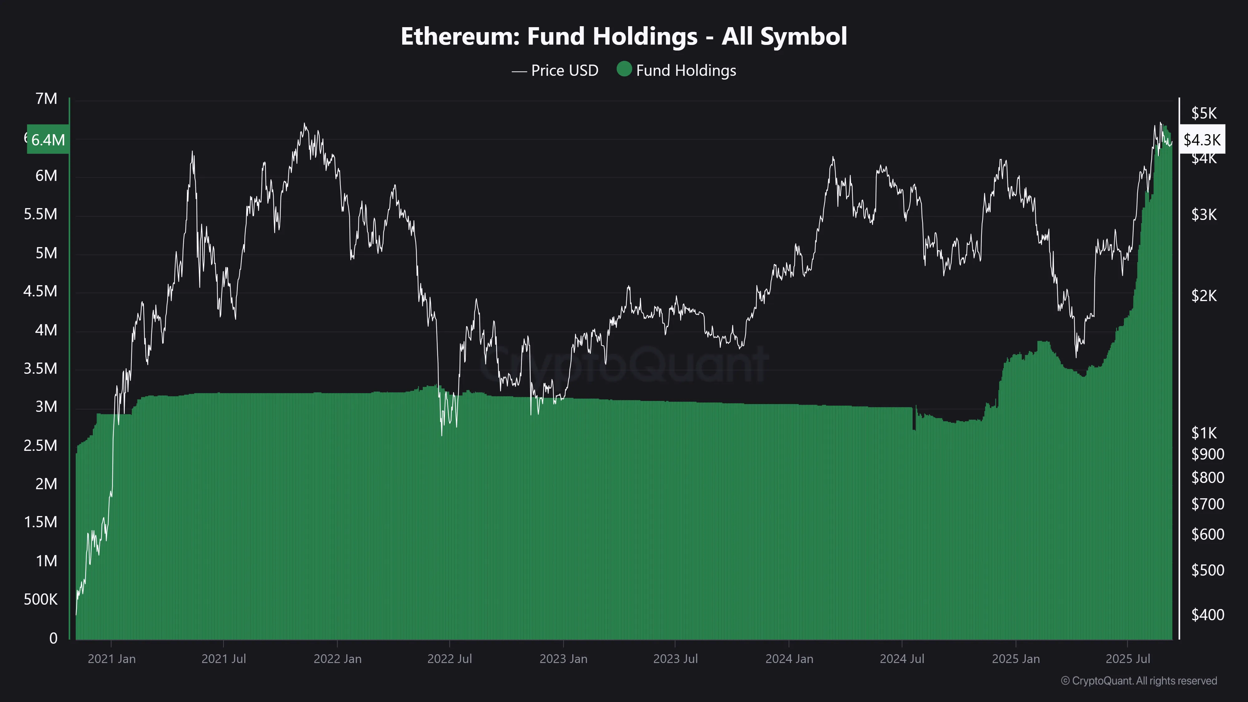
• Investment Funds
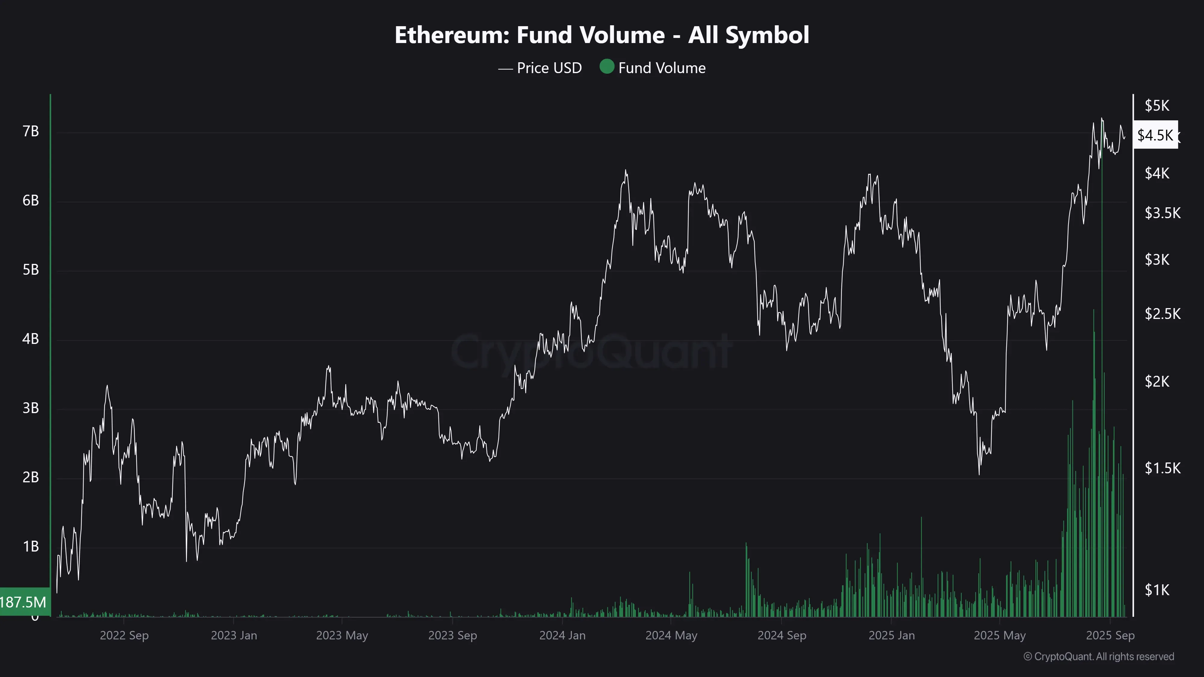
Currently, institutional metrics show a profound change compared to 2021. Holdings of ETH by funds nearly doubled (+98 %), increasing from 3,213,450 ETH ($13.8 billion) to 6,387,239 ETH ($27.4 billion), and the average volume traded by these entities multiplied by 12.83 (+1,183 %) from $250 million to $3.2 billion.
Conclusion: This information reflects the evolution of Ethereum, how it ceased to be a limited asset to the crypto ecosystem and became part of the U.S. financial system, being adopted on Wall Street by large investment funds like BlackRock. Moreover, from the end of the year onwards, institutional demand could increase even more thanks to the first pro-crypto federal laws promoted in the United States and the incorporation of staking (a way to earn annual returns with ETH) as a service on Wall Street.
Green area = amount of ETH purchased by investment funds:
Green area = trading volume (USD) of investment funds:
On this point, I recommend reading the note I wrote about it:
https://fin.guru/es/tecnologia-e-innovacion/digital-commodities-bitcoin-and-ethereum-3epklrs4ao
Topics viewed:
A) First federal pro-crypto laws of the U.S.
B) The institutional evolution of Bitcoin and Ethereum.
C) Ethereum and its ecosystem.
D) The Wall Street narrative.
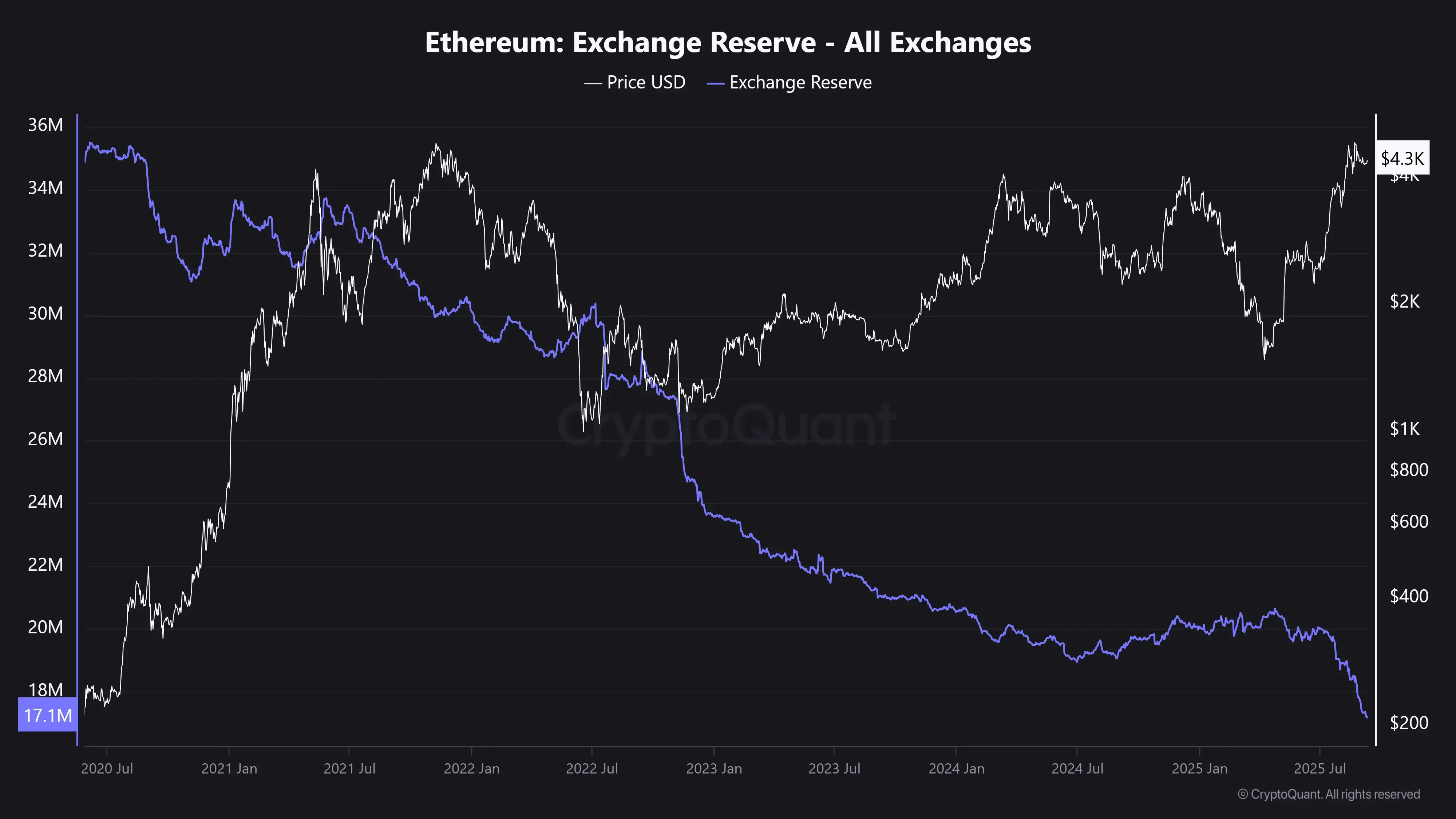
• Deposits in CEXs
ETH reserves in CEXs (for example, centralized exchanges like Binance) fell by −38 % and the supply ratio decreased by a similar percentage (−39 %).
Conclusion: This reduction marks a significant difference compared to 2021, when available volumes on exchanges were higher. The low supply of ETH in CEXs creates a structurally bullish environment in the long term.
Purple line = amount of ETH deposited in CEXs:
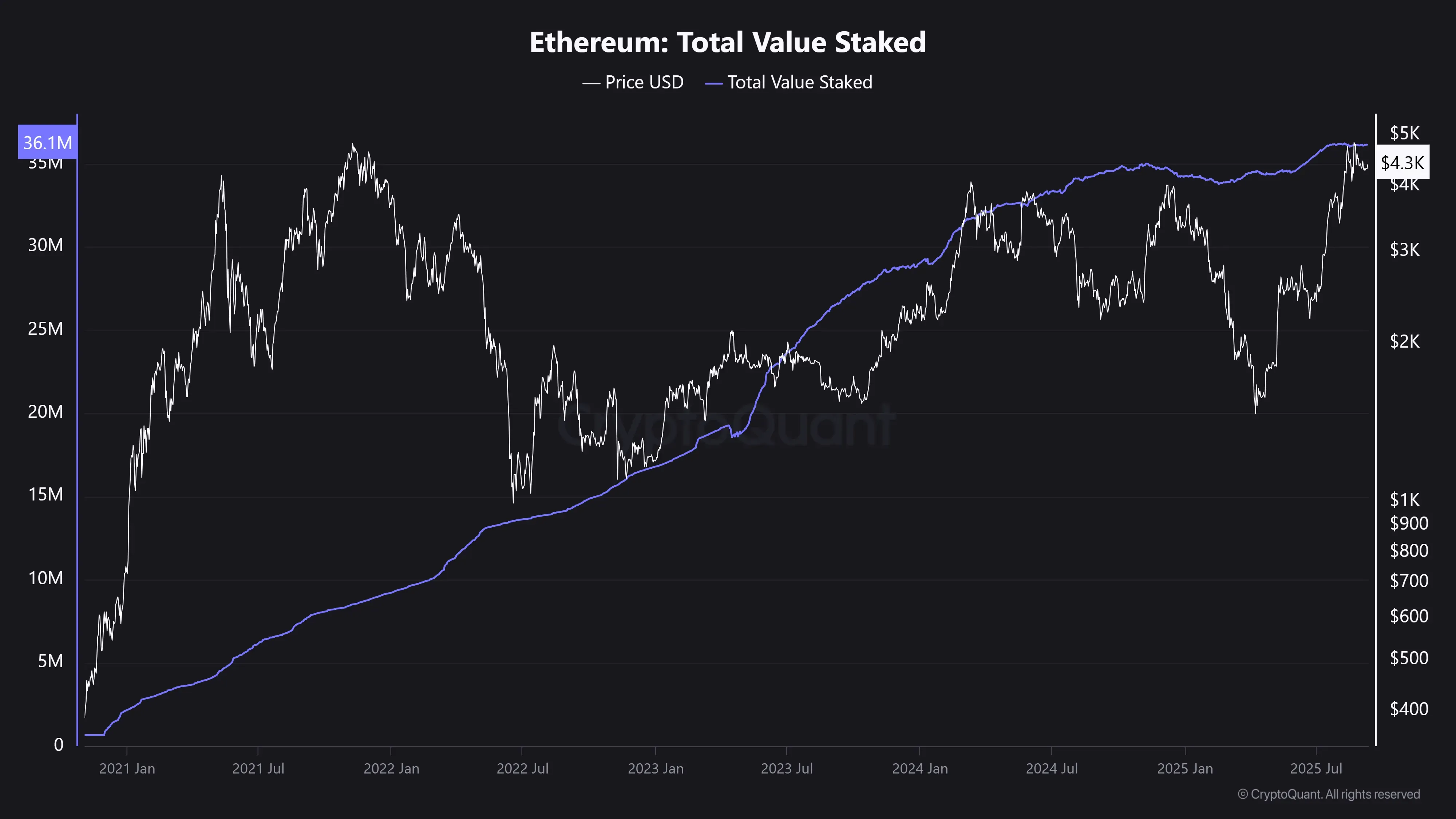
• Staking and Supply
The amount of Ethereum deposited in staking (a way to earn annual returns with it) grew from 8.53 million ($36 billion) to 36.15 million ETH ($155 billion) in four years, that is, +323 %, while total supply only increased by 2.78 %.
Conclusion: This data positions Ethereum as a productive and low-emission asset. The combination of controlled supply and high demand for staking indicates a favorable and solid scenario for the ecosystem.
Purple line = amount of ETH deposited in staking:
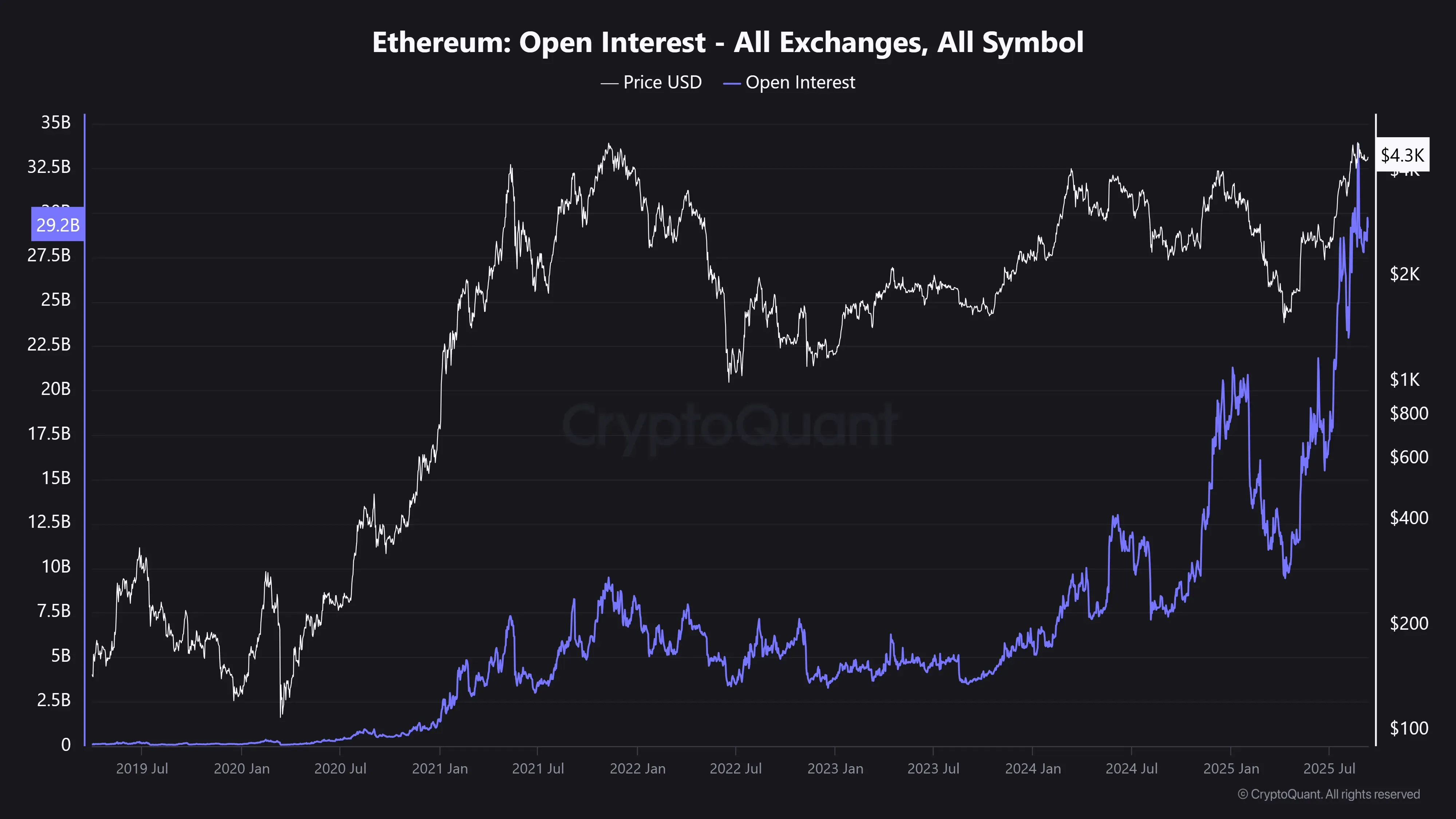
• Derivatives
Open interest (amount of USD committed in the derivatives market) is 3.68 times higher than in 2021 (+268 %), confirming a much larger futures market. It went from $8 billion to $32 billion in 4 years.
The funding rate fell by −39 %, indicating a more balanced distribution between long and short positions compared to 2021.
In liquidations, there was an increase in longs (+92 %) and a significant increase in shorts (+333 %), suggesting episodes of squeeze in both directions, with more incidence on the bearish side.
Conclusion: Currently, there is high speculation with very high leverage levels compared to 2021, which can generate a favorable situation for rapid and volatile movements. The large number of recent liquidations demonstrates that the market can react with strong intensity. The accumulated tension could resolve in sharp movements in any direction, whether downwards or upwards. In this context, it is essential to apply strict risk management. Extreme caution, constant monitoring, and a mandatory stop loss (a sell order that is executed automatically when the previously defined price is reached) are recommended when trading.
Purple line = amount of USD committed in the derivatives market:
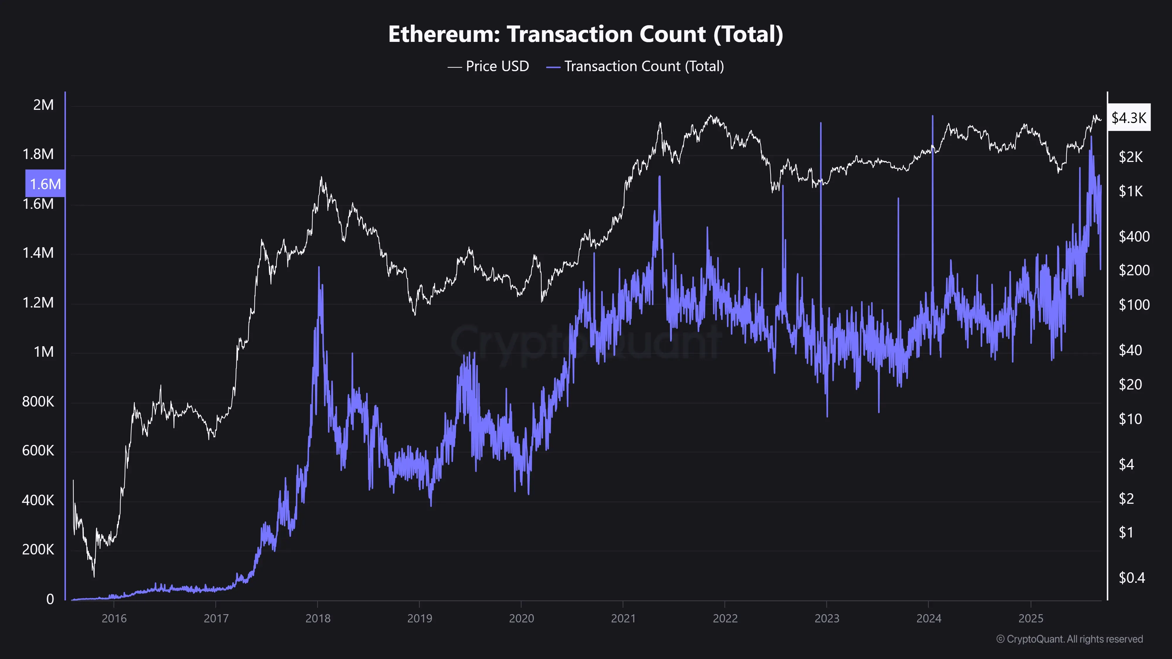
• Network Activity
On-chain activity shows moderate variations: active addresses −16 % and transactions +12 %.
Conclusion: Network usage remains solid and consistent, without signs of euphoria or severe contraction.
Purple line = number of transactions made on the ETH blockchain:
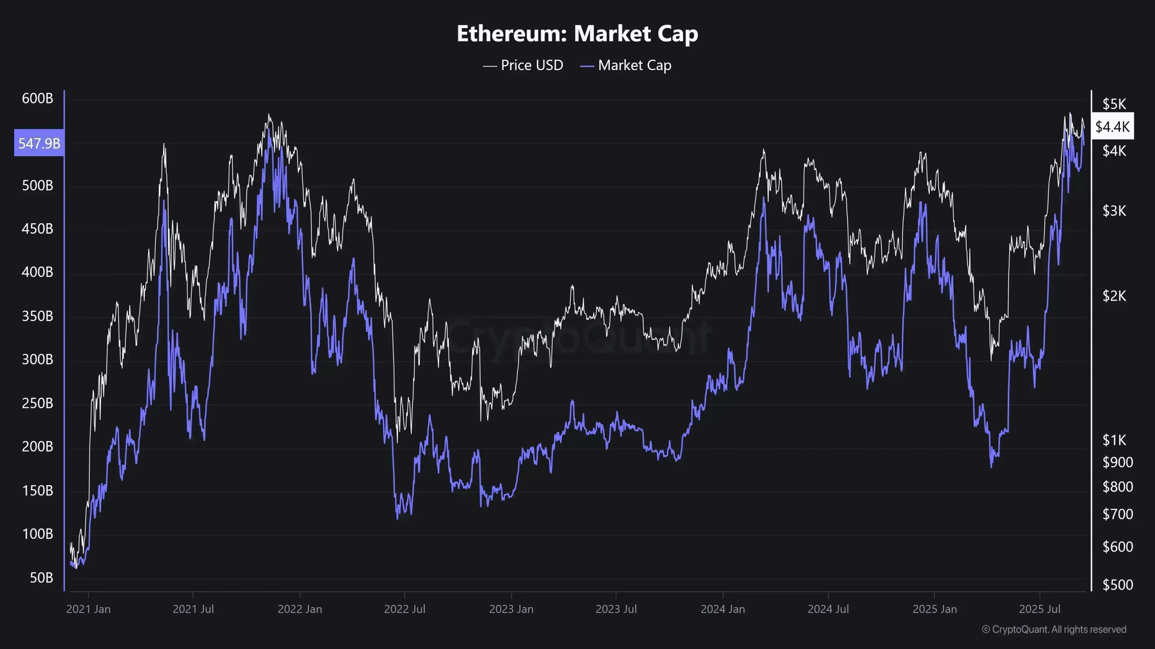
• Market Data
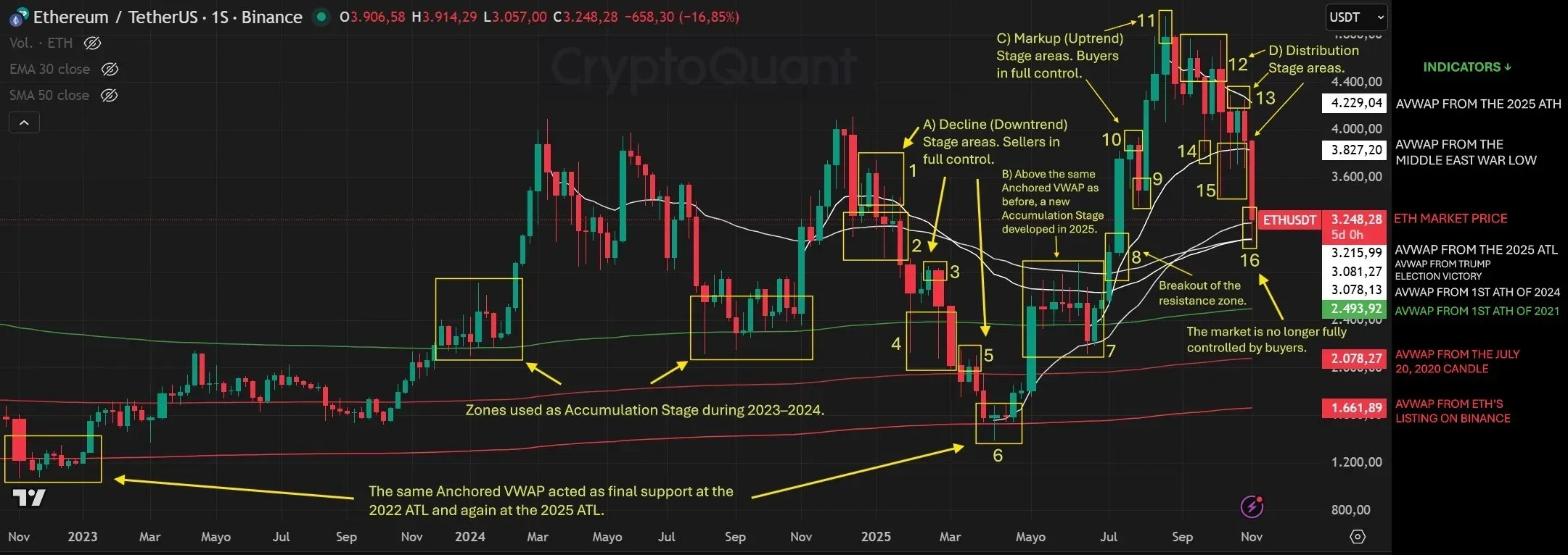
Beyond price and market capitalization, which remained without exaggerated differences, at this point I want to highlight how ETH traversed the 4 stages of the market during this year. To do this, I share the image I prepared and the last post I wrote for CryptoQuant. It can be translated into Spanish on the same page.
3K ETH: The Drop Explained ↓:
https://cryptoquant.com/insights/quicktake/690ae9e953a486722b83187a-3K-ETH-The-Drop-Explained

Comments